As an Amazon Associate I earn from qualifying purchases and sometimes recommend products from other sellers at no extra cost to you. For more details see my disclosure policy and privacy policy.
This post may contain affiliate links - I may make commission from any purchases.
Before a shopper reads your product title, before they zoom in on your stitching or your glaze, they see colour. It happens in a fraction of a second, and it decides whether they keep scrolling or stop to look closer. For handmade sellers, that makes colour one of the highest-leverage decisions you make, right up there with pricing and photography.
Colour trend reports can feel like noise if you’ve never used them deliberately. But treated the right way, they’re less a set of rules and more a shortcut into what your customers already expect to see this year. This post walks through why colour trends matter, what’s shaping palettes for 2026, and how to borrow from them without your shop losing the identity that makes it yours.
Table of Contents
What’s Your 2026 Handmade Colour Palette?
Four quick questions to find the trend palette that actually fits your shop.
Why Colour Trends Matter for Handmade Sellers
The First-Glance Effect
Colour does its work before anything else on the page gets a chance to. A shopper scrolling Etsy or Pinterest processes the overall palette of a listing before they consciously register what the item even is. If your piece looks dated or clashes with what’s currently everywhere in home and fashion, it can get scrolled past even when the craftsmanship is excellent.
This is why trend-aware sellers often outperform equally skilled makers who ignore colour shifts entirely. It’s not that trend colours are inherently better. It’s that they signal “current” in a way that helps a browsing shopper feel confident clicking through.
What Colour Signals Before You Say a Word
Colour also carries emotional shorthand that shoppers read instinctively. Green tends to signal eco-consciousness and calm, blue reads as trustworthy and dependable, and purple leans toward luxury or creativity. Warmer tones like orange and yellow feel energetic and approachable, which is part of why they show up so often in kids’ crafts and cheerful gift items.
If you’ve read the symbolism of orange breakdown here before, you’ll recognise this idea already: colour is doing storytelling work, whether you plan it or not. The goal isn’t to memorise a colour-meaning chart and follow it mechanically. It’s to notice when your palette is accidentally working against the story you want your product to tell.
The 2026 Colour Landscape Handmade Sellers Should Know
Calm Neutrals Are the New Bestsellers
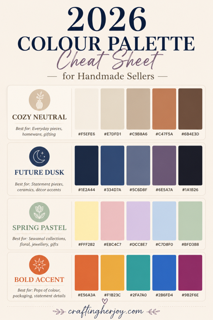
Forecasts for 2026–27 lean heavily toward comforting, low-drama neutrals. Soft whites, warm clays, and cocoa browns are showing up repeatedly across interior and homeware predictions as the colours retailers expect to move in volume. For handmade sellers, that’s genuinely useful information: neutrals like these are typically your safest, most repeat-purchase-friendly colours, and 2026 is rewarding them more than usual.
Craft-specific trend watchers are seeing something similar, with creams, oatmeals, and earth tones described as “cozy” palettes making a strong comeback. If your shop already leans neutral, you’re in a good position this year without changing much at all.
Where the Bold Colours Fit In
Brighter accents haven’t disappeared, they’ve just been repositioned. Luminous blues and energetic oranges are being recommended in smaller doses, as accent pieces rather than whole-collection colours. That’s a useful distinction for makers working with limited materials or time: you don’t need to rebuild your entire line around a bold shade, just introduce it in a handful of statement pieces.
Spring 2026 is also seeing a strong showing from butter yellow, dusty pink, and cool blue in fashion, with beige and flax as the neutral backbone underneath them. Given how often craft and handmade trends follow fashion by a season or two, these are worth watching if you sell anything seasonal.
Deeper, Moody Shades for Statement Pieces
Alongside the soft palettes, some forecasters are pointing to deeper, more atmospheric shades like Future Dusk, a twilight blue, as a defining colour for 2026 and 2027, particularly in handmade décor. This kind of colour tends to work best on a small number of pieces rather than across a whole product range. Think of it as your “gallery piece” colour rather than your everyday listing colour.
If you’ve been following Pantone’s Colour of the Year picks in past years, this pattern will feel familiar. The headline trend colour is rarely meant to dominate a collection. It’s meant to be the accent that makes an otherwise neutral piece feel current.
Translating Trend Colours Into Handmade Products
Seasonal Palettes Across Product Categories
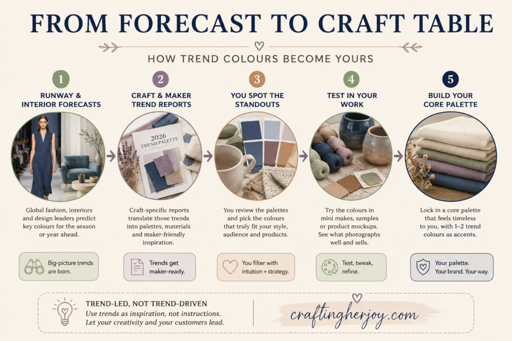
Trend reports usually present colour as a small curated set, something like “earthy neutrals plus one accent,” rather than a long list. That’s actually good news for makers, because it’s easy to apply the same logic across very different product types. Jewellery and homeware in particular tend to follow familiar seasonal rhythms: softer pastels and fresh greens in spring, richer metallics and darker tones as autumn and winter approach.
The advantage of leaning into this rhythm is that your pieces start to feel easier to style and easier to gift, because they echo what shoppers are already seeing everywhere else, from clothing racks to interior displays. You’re not asking them to imagine how your piece fits into their world. You’re showing them.
A Ceramic Seller’s Example
Picture a ceramic seller who normally works entirely in grey and white, a safe, timeless palette that’s served them well. For 2026, rather than reinventing their whole line, they introduce a small run of oatmeal mugs finished with a Future Dusk rim, plus a handful of butter-yellow accent dishes for spring.
The neutrals do what neutrals always do: they keep the collection wearable and timeless, and they’re what most customers will actually buy. The trend colours do something different. They make the collection feel current and “Pinterest-friendly” without touching the maker’s underlying style. That’s the model worth copying, regardless of what you make.
Using Colour Psychology to Support Your Product Story
Matching Mood to Product Type
Because shoppers often make fast, emotional purchase decisions, your palette can support the mood you want them to feel without you writing a single extra word of copy. Tranquil, muted colours suit self-care and wellness products. Lively brights suit children’s items. Sophisticated, deeper tones suit statement jewellery or gallery-style pieces.
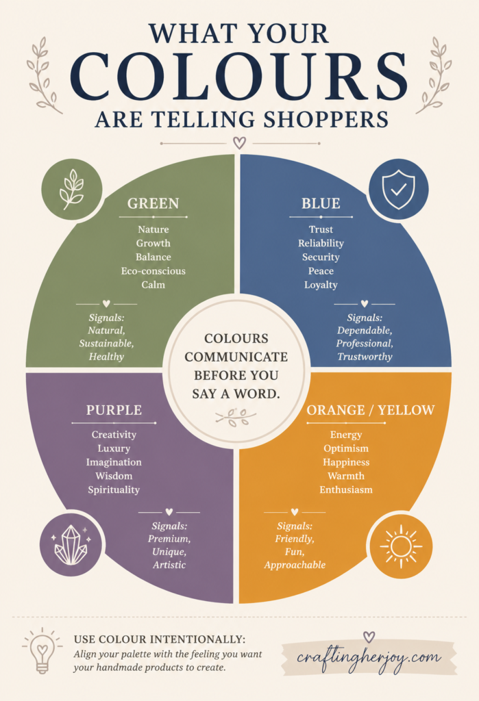
This is worth sitting with for a moment if you sell across a few different product lines, because it means one palette rarely fits everything you make. A calming lavender that works beautifully on a self-care candle might feel flat on a bold statement necklace, even if you personally love the colour.
Building a Recognisable Brand Colour
At the same time, colour is one of the fastest ways a repeat customer recognises your work without reading your shop name. Consistent use of a few related colours, even as trends shift around them, gives your shop a curated, intentional feel rather than a random one. This is part of why good product photography matters so much for handmade sellers: it’s often the first place your signature palette actually gets seen.
Using Trends Without Losing Your Own Style
Start With Your Core Palette, Then Layer In Trends
The sellers who use colour trends well almost never chase every forecast. Instead, they define a core palette that reflects their brand, something like warm neutrals and soft greens, and then layer in one or two trend colours per season on top of it. This keeps the shop visually fresh without sacrificing the recognisability that took months or years to build.
It’s worth treating this the same way you’d treat any other brand decision: understand the emotional impact of the colours involved, take a look at what similar sellers in your niche are doing, and then decide deliberately where your palette can stand out rather than blend in.
Validate Before You Commit
Trend reports are inspiration, not instructions. Before restocking materials around a forecasted colour, it’s worth checking what’s actually selling in your specific niche, whether that’s through Google Trends, Etsy’s own search data, or simply watching what gets saved and shared on Pinterest. Many experienced Etsy sellers will tell you that a trend colour only works if it suits your ideal customer and your product type. A classic palette that your customers already love can outperform this year’s “colour of the year” every time.
Bringing It Together
Colour trends aren’t a script to follow line by line, they’re a signal of what’s already catching people’s attention this year. The sellers who benefit most from them tend to do three things consistently: they keep a small, reliable core palette that customers recognise, they add trend colours in limited, deliberate doses rather than across an entire collection, and they check real demand in their own niche before committing materials or time.
If you haven’t looked at your shop’s palette in a while, this is a good moment to do it. Pull up your best-selling listings side by side and see whether your colours are still doing the storytelling work you want them to.
Continue Your Journey
- The Symbolism of Orange: Everything You Need to Know — a deeper dive into what one specific colour communicates.
- How to Take Eye-Catching Photos of Your Crafts — make sure your palette actually reads correctly in your listing photos.
- 10 Mistakes to Avoid When Starting an Etsy Shop — where colour and branding decisions fit into the bigger picture.
What’s your shop’s core palette, and have you added any 2026 trend colours to it yet? I’d love to hear in the comments.
Want colour trend breakdowns and craft business tips like this delivered straight to your inbox? Subscribe to the Crafting Her Joy newsletter below.